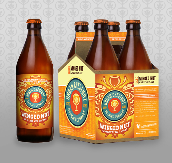
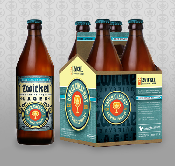
It all started with 4-packs.
The creative challenge was to create a cohesive brand on the shelf- a brand with strong stopping presence, carving out a niche in a crowded field. Marketing28 used a wallpaper of the goblet icon from the logo, and created feature areas for each piece of label art. We also separated the series by having Revolution Orange be the main color for that series, and Reverence Blue for the Reverence Series. A large logo on the ends tell a customer in no uncertain terms who the beer is coming from.
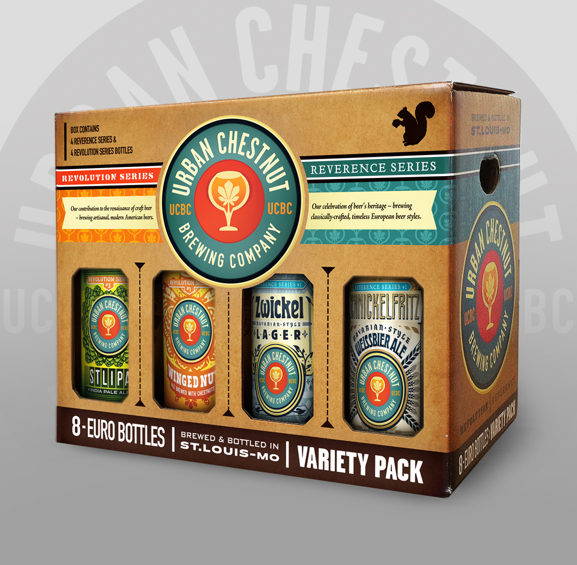
Sampler packs were designed with the fact that there would always be 2 Revolution beers, and 2 Reverence beers. Clear color-coding separates the two series sides.
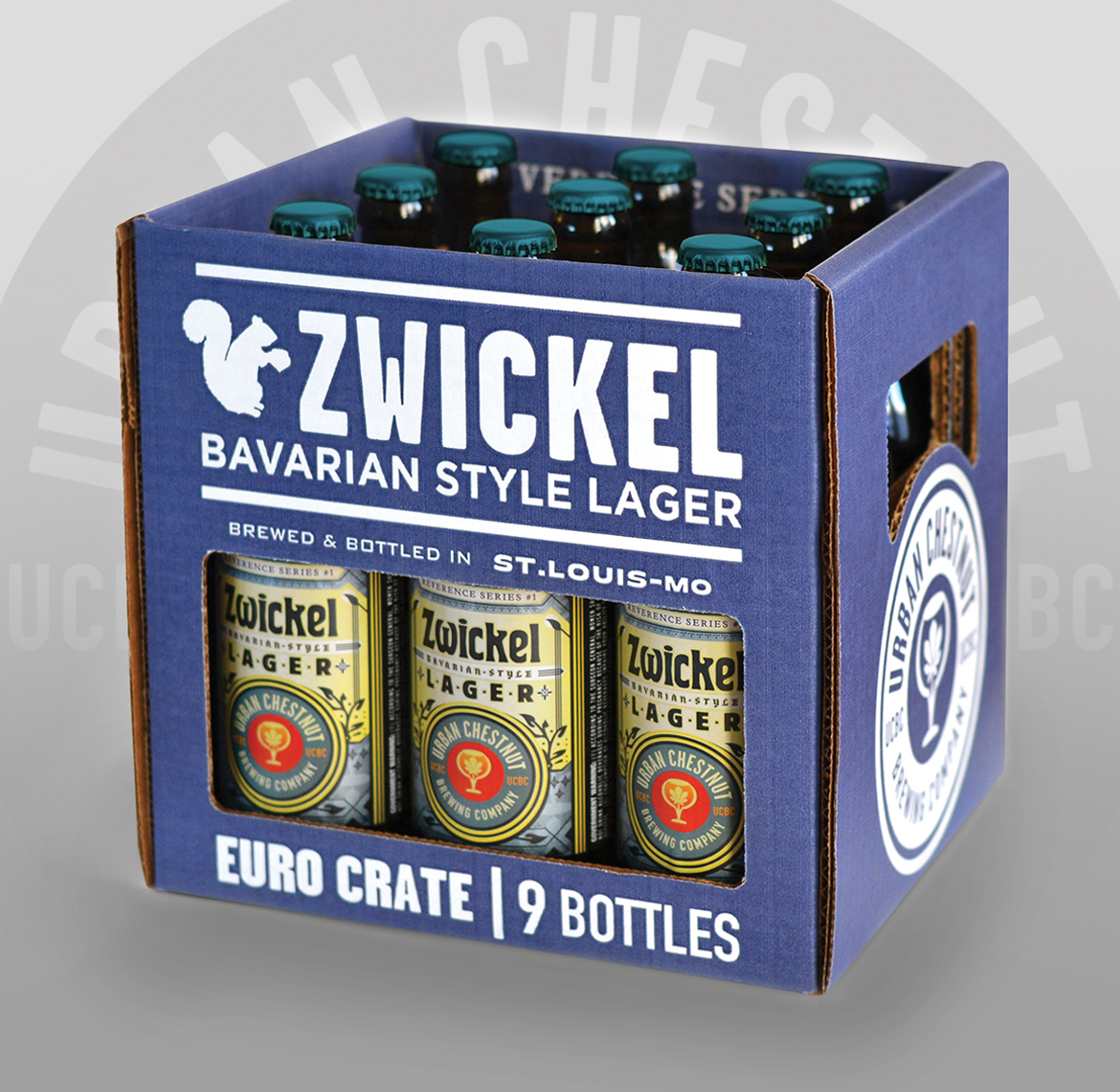
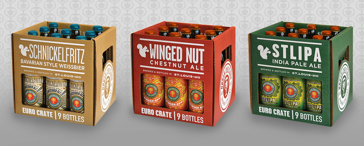
Then we moved on to Euro Crates. Designed to emulate the crates found in Germany, they needed to have a simplicity but still fall within the brand.
And the German Hallertauer Series 4-packs were created to emphasize 'Hallertauer green', and to establish that distinct look.
Beyond that we've created shipper cartons, Cellar Series containers, and much more.
Have packaging design needs? Contact Marketing28 today. Prost!